(Event Campaigns + Visual Direction + Copywriting for a Cult London Fair)
CHALLENGE
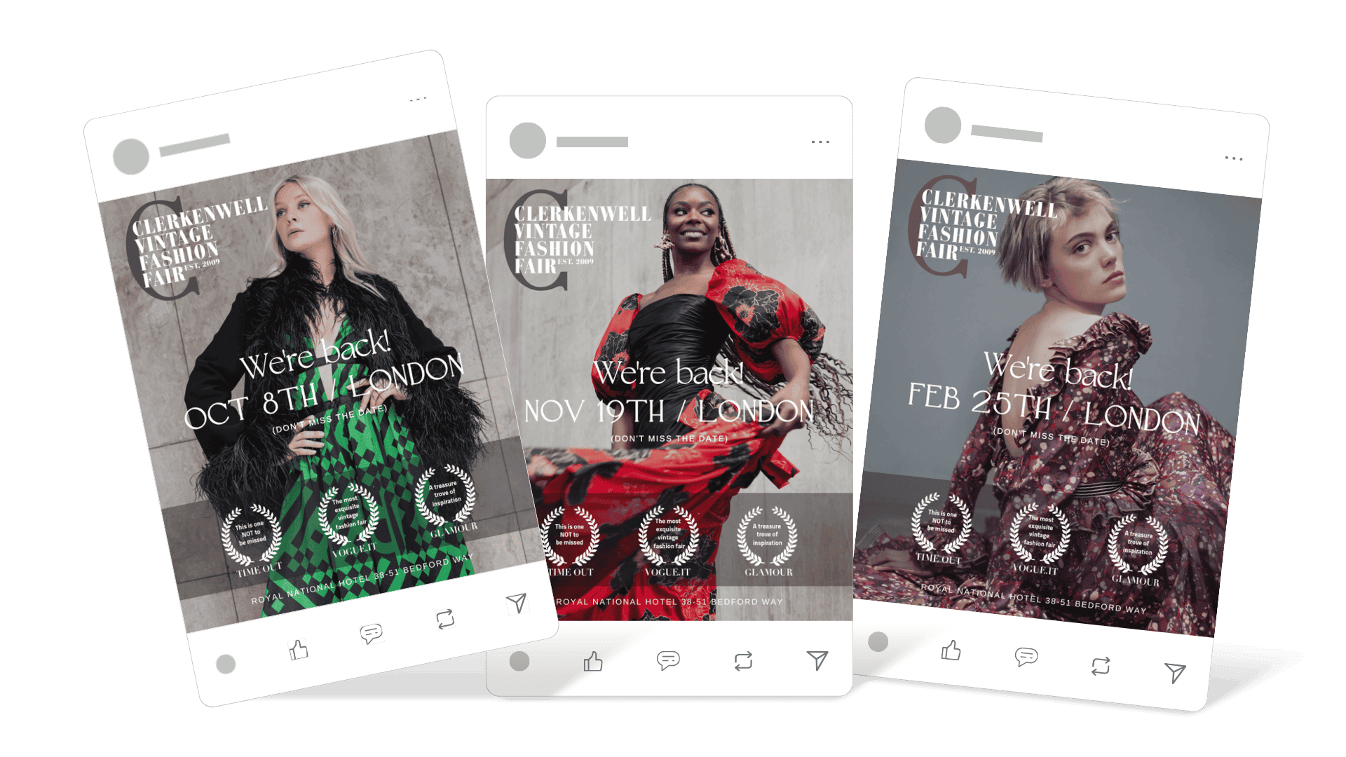
Clerkenwell Vintage Fashion Fair had built a strong name in the vintage circuit, with media features from Vogue Italia, Glamour, and Time Out. The challenge was to create fresh seasonal campaigns that didn’t feel like typical event posters — but rather, like fashion editorials with attitude and allure.
Ads (Static):
Ads (Static):
(more creatives upon request)
STRATEGY
We approached each campaign like a mini editorial: striking portraiture, expressive styling, and “effortless cool” as the tone. Our aim was to elevate the CVFF identity to a place where fashion lovers, collectors, and creatives alike felt they were walking into something iconic.
Key directions:
Magazine-style type layout
Modern serif fonts for heritage feel
Seasonal yet timeless palette
Tagline: “We’re back!” with rotating models to reflect diversity and trend fluidity
EXECUTION
Each visual featured a different muse, each embodying a unique facet of vintage fashion:
(more creatives upon request)
(more creatives upon request)
February – Romantic Rebel
Soft focus, structured pose, rich burgundy floral
Feeling: Classic couture with quiet rebellion
October – Glam Graphic
Green-black contrast, retro-feather statement coat
Feeling: Modern diva meets 70s soul
November – Movement & Drama
Cinematic red dress in motion, wind and confidence
Feeling: Celebration, joy, iconic drama
Design Details:
Laurel-style quotes from press = credibility without clutter
Elegant spacing and type balance = fashion-magazine aesthetic
One-liner CTA: “Don’t miss the date” — minimal and chic
RESULTS
Increased CTR and engagement.
Dramatic improvement of ROAS.
Boosted add-to-carts and conversion rates
COPYWRITING HIGHLIGHTS
“We’re back!” (Event CTA as a signature)
“This is one NOT to be missed” — TIME OUT
“The most exquisite vintage fashion fair” — VOGUE.IT
“A treasure trove of inspiration” — GLAMOUR